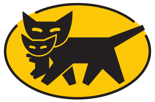
On April 1, 2021, our beloved kuro-neko logomark will change a little bit. The kuro-neko itself, carrying the all-important kitten in its mouth, will not change. We will develop the comprehensive services we have accumulated to gain the trust of our customers to be even more thorough and more refined. This is a declaration of the Yamato Group’s commitment to creating the next generation of delivery services.


For this redesign, we inspected every potentiality of the kuro-neko logomark, every detail of every shape, including eyes and ears. For the background, we replaced the traditional outlined oval with a soft and expansive ellipse. This new logomark is a successor to the traditional logomark of the Yamato Group, a leader that will continue to move forward.
In addition, we have developed exclusive logotypes for each of the group’s companies, with the goal of making them both more readable and more sophisticated.

There are four corporate colors. We will take care to ensure that all the different items, not to mention our trucks, reduce noise and are rooted in the local environment and blend in naturally.
We will use the redesigned symbol mark, logotype and corporate colors to express the vitality of the Yamato Group in creating ever more advanced distribution services.
